10 Common Graphic Design Mistakes and How to Avoid Them

Graphic design is more than just creating pretty pictures. It’s about communicating ideas effectively and engaging your audience. Whether you’re designing a website, a poster, or a social media graphic, your design can make or break your message. This blog post aims to help you identify common graphic design mistakes and provides practical solutions to avoid them. As a graphic design company in Kolkata, we understand the nuances that go into creating effective designs. By the end of this read, you’ll have a clearer understanding of how to create designs that not only look good but also work effectively.
Mistake 1: Ignoring the Target Audience
What is Target Audience?
Your target audience is the group of people you want to reach with your design. They are the ones who will interact with your work, so understanding their preferences, needs, and behaviors is crucial.

Consequences of Neglecting Audience Preferences
Ignoring your target audience can lead to designs that miss the mark entirely. If your audience doesn’t connect with your design, they’re likely to ignore it. For instance, a playful and colorful design might work well for a children’s product but would be inappropriate for a corporate financial report. To avoid this mistake, always keep your audience in mind and tailor your design to their preferences and expectations.
Mistake 2: Cluttered Layouts
What is Visual Clutter?
A cluttered layout is one that feels chaotic and overwhelming. This happens when too many elements compete for attention, making it hard for the viewer to focus on the main message.

Tips for Maintaining Clean and Organized Layouts
- Limit the number of elements: Stick to the essentials and remove anything that doesn’t serve a purpose.
- Use grids: Grids help organize your content, making it look neat and balanced.
- Whitespace is your friend: Don’t be afraid to leave empty spaces. It helps to give your design breathing room and guides the viewer’s eye to the important parts.
Mistake 3: Poor Font Choices
Importance of Typography
Typography is a key element of design that can significantly impact how your message is perceived. The right font can convey professionalism, fun, seriousness, or creativity.

Common Font-Related Mistakes and Solutions
- Using too many fonts: Stick to 2–3 fonts maximum to keep your design cohesive.
- Inappropriate font choice: Ensure the font matches the tone of your content. For instance, a whimsical font might not be suitable for a legal document.
- Illegible text: Make sure your text is readable. Avoid overly decorative fonts for body text and ensure sufficient contrast between text and background.
Mistake 4: Lack of Hierarchy
Understanding Visual Hierarchy
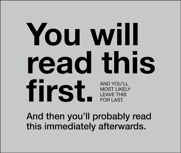
Visual hierarchy is the arrangement of elements in a way that implies importance. It helps guide the viewer’s eye to the most important parts of your design first.

Techniques to Establish Effective Hierarchy
- Size and scale: Larger elements are usually perceived as more important.
- Color and contrast: Use color and contrast to make important elements stand out.
- Positioning: Place key elements in areas where the eye naturally falls first, like the top or center of the design.
Mistake 5: Inconsistent Branding
What is Branding Consistency?
Branding consistency means maintaining a uniform look and feel across all your design materials. This includes using the same colors, fonts, and style elements.

Strategies to Ensure Cohesive Brand Visuals
- Create a style guide: A style guide outlines your brand’s colors, fonts, and design principles. It serves as a reference to ensure all your designs align with your brand.
- Stick to your style guide: Consistently apply the guidelines to all your designs to build a cohesive brand identity.
- Review regularly: Periodically review your designs to ensure they remain consistent with your branding guidelines.
Mistake 6: Overusing Effects
Types of Design Effects (Shadows, Gradients, etc.)
Design effects like shadows, gradients, and filters can add depth and interest to your design. However, overusing them can make your design look amateurish and cluttered.

Guidelines for Appropriate Use of Design Effects
- Use effects sparingly: Less is more. Apply effects to enhance, not overwhelm, your design.
- Stay subtle: Subtle effects can add sophistication and polish to your design.
- Ensure readability: Make sure effects do not compromise the readability of your text or the clarity of your message.
Mistake 7: Wrong Color Combinations
Impact of Color on Design
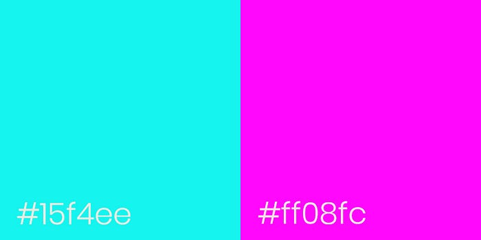
Color is a powerful tool in design that can evoke emotions and set the tone for your message. The wrong color combination can confuse or repel your audience.

Tools and Resources for Color Selection
- Color theory: Understanding basic color theory can help you choose harmonious color combinations.
- Color wheel: Use a color wheel to find complementary, analogous, or triadic color schemes.
- Online tools: Tools like Adobe Color or Coolors can help you create and test different color palettes.
Mistake 8: Neglecting White Space
Importance of White Space in Design
White space, or negative space, is the empty space around and between elements in a design. It’s crucial for creating a clean, organized look.

Tips for Effectively Using White Space
- Balance: Ensure there’s enough white space to balance the elements in your design.
- Padding and margins: Use padding and margins to create natural spaces between elements.
- Simplify: Don’t overload your design with too much content. Embrace minimalism to let your design breathe.
Mistake 9: Ignoring Responsive Design
What is Responsive Design?
Responsive design means creating a design that looks good and functions well on various devices and screen sizes, from desktops to smartphones.

Best Practices for Adapting Designs Across Devices
- Flexible layouts: Use flexible grids and layouts that adapt to different screen sizes.
- Media queries: Apply CSS media queries to adjust styles based on device characteristics.
- Test on multiple devices: Always test your design on various devices to ensure it’s responsive and user-friendly.
Mistake 10: Failing to Get Feedback
Value of Constructive Criticism in Design Processes
Feedback is essential for improving your design. Constructive criticism can help you see flaws and areas for improvement that you might have missed.

Methods for Collecting and Implementing Feedback
- Peer reviews: Ask colleagues or fellow designers for their input.
- User testing: Conduct user testing to get feedback from actual users.
- Iterate: Use the feedback to make revisions and improve your design continuously.
Conclusion
Graphic design is a blend of creativity and strategy. By avoiding these common mistakes and applying the solutions provided, you can create designs that are not only visually appealing but also effective in communicating your message. Remember, good design takes practice and continuous learning. Keep refining your skills, stay updated with design trends, and always seek feedback to improve. Happy designing!
